Taxfix, 2024 - Checkout - Pricing Model
In-App Pricing Survey
How to uncover powerful insights to optimize a pricing model opt-in rate.
The Challenge
Introduce a clear and valuable pricing model where users pay more to defer filing fees until receiving their tax refund. Design and implement Taxfix's first in-app survey to assess customer perception, optimize the model, and identify potential drawbacks.
My Role
UX Design, Research Strategy, Interaction Design, Prototyping, Usability Testing, and Visual Design.
The Situation
What's the problem?
A Taxfix merger introduced hybrid pricing for a pay-later feature, significantly boosting ARPS (Average Revenue Per Submission). Fake door tests confirmed the potential, leading us to adopt a similar model.
User problem
Intransparent pricing - €35 + 10% is only clear if users can do the math. Leadership pushed for an aggressive rollout without offering calculations, but we insisted on thorough research alongside the launch to provide stronger recommendations later.
Business problems
Trust and brand image - The hybrid pricing model boosted revenue, but its potential impact on the Taxfix brand remained uncertain, posing a risk.
Inflexible standard solution - A pricing model tied to tax refunds helps cash-strapped users, but would a single communication approach resonate with them?
Discovery
Reserach Strategy
We wanted to mitigate risks and uncover how users felt about the new pricing model in ways that would enable us to pivot if necessary. Our focus areas were:
Comprehensibility – Perception – Motivation – Long-term Risk Indicators
Our challenge was communicating the hybrid pricing model effectively while anticipating long-term risks during peak season. To gather immediate feedback without impacting conversions, I proposed a strategically placed survey in the user journey—right after users submitted their tax return. Positioned just after the payment step, it seamlessly fits the filing process while safeguarding the conversion rate of submission.
Entry point design
Co-creating the entry point screen
The screen design was a collaborative effort, guided by a detailed brief I created for a lean design workshop. Together, we explored on the entry point pattern and iterated on multiple design variants. These were further refined through close collaboration with researchers, product marketing managers, data engineers, and content designers, ensuring the final design was both intuitive and impactful.

Final Screen Design

User flow
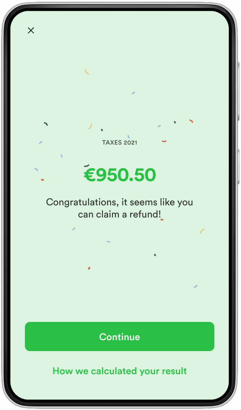
Placement directly after point of sale
The entry point was placed after the moment when users pay and submit (revenue-creating moment). This is the reason why the entry point theme was celebrating the filing's success. This is how a user navigates from the pricing model to the survey:
Payment

Submission

Survey Entry Point

Survey Webview

Quantitative study
Survey performance
This entry point concept with a full-screen celebration moment after submission, along with a raffle prize of 100€ created an unprecedented amount of amount of survey responses in record time.
28 Questions
7.000 Responses
86% completion rate
10 days
Stakeholder Management
Research insights - Users who didn't choose pay later
These are our main findings from the survey:
-
Pay later is more attractive among young people, with lower income and lower refund estimate
-
Lower experience with tax filing & limited funds available are triggers for selecting the Pay Later option
-
Selecting the payment option is intentional
-
The Pay Later option is clear for most but for ~⅓ of opt-ins there is some confusion around the final price
-
The Pay later option is well received also by not-opt ins and there are no indications that this affects their opinion of Taxfix or intention to retain
-
To get more people interested in the Pay Later option mentioning the maximum price would help
Stakeholder Management
Refining pay later for users with higher refund
As responses for users with higher refunds indicated that if we were to communicate a maximum price, users would be more willing to book Pay Later, we refined the payment screen for this user segment. Here I worked through some variations of the card design to implement a max cap signifyer. Here is me working through some card patterns to the final design:
Designing card variations


Most upvoted card design
Clickable chip with reassuring shiel icon

Clickable info icon
Just enough text
Low refunds
No maximum price communication
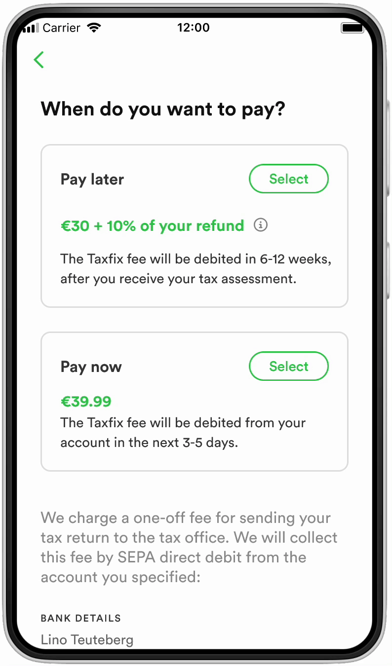
High refunds
Maximum price communication

Mentioning the maximum price of pay later led to
+16.6% ARPS* for users with high refunds
After implementing the communication about the maximum price of pay later, users with higher refunds were converting significantly better. We knew pay later was not impacting the business or the users negatively, although the offering could be further improved for clarity.
(* Average Refund Per Submission)
Last words
Learnings
This project was challenging, balancing business goals with user needs and safety. I’m proud it revealed that variable pay-later pricing was well-received and that clear pricing earned customer trust. I also learned the value of pursuing novel testing ideas, even without a clear precedent.


