Taxifx 2024 - Fintech - Onboarding
Smooth and Secure Login
Re-designing Taxfix's login from a 4-digit PIN to a one-time password across iOS, Android, and web.
The Challenge
How might we create an effortless and super secure login experience for millions of customers while keeping login CVR unchanged and within budget?
My Role
UX Design, Research, Interaction Design, Prototyping, Usability Testing, Visual Design, Stakeholder Management.
The Situation
What's the problem?
Out of several issues identified, three stood out as significant challenges for users and the business:
User problem
Inconsistent user experience - The previous PIN-based login system felt outdated and offered little flexibility, creating a fragmented experience for users accustomed to more modern authentication methods.
Business problems
Security vulnerabilities - The PIN login approach presented potential security risks, which could compromise user data and trust in the Taxfix platform. Taxfix had to become compliant by 2024, or otherwise face penalties.
High maintenance costs - The legacy system required frequent updates to address usability and security concerns, leading to high engineering costs and diverting resources from new feature development.
Discovery
Desk research
Through user research, data analysis, and security evaluations, we uncovered valuable insights:
Preference for ease of access - Users showed a strong preference for quick and straightforward login methods, with OTP favored over PIN due to its perceived security and convenience.
High mobile usage - A majority of users accessed Taxfix primarily through mobile devices, making seamless authentication crucial for mobile-first experiences.
Security concerns - Research revealed that users had concerns over PIN-based authentication, which was seen as less secure.
Frequent login attempts - Data showed that users often needed to log in multiple times, increasing friction and leading to potential drop-offs in usage.
Opportunity
Less friction in a longer login flow?
As this initiative was a full rollout and no A/B test, we had to be rigorous in our strategy: Change the previous design as little as possible, but make it as smart as possible.
Design Principles
1. Reduce the number of clicks
2. Personalize and simplify instructions as much as possible
3. Automate data input and validation
4. Remove all distractions
5. Re-use known patterns to benefit from recall effect
6. Apply UX psychology wherever possible
Opportunity
Design process
The design process was a mix of investigating pattern guidelines, collaborating with content designers to simplify the task as much as possible, collaborating closely with engineers to stay within the technical constraints of our platform partner Auth0, and testing with users in an unmoderated setting. Here are some snapshots of what my design process looked like:
Mapping the technical flow

Experience benchmarking

Concept testing

Tidy handoff

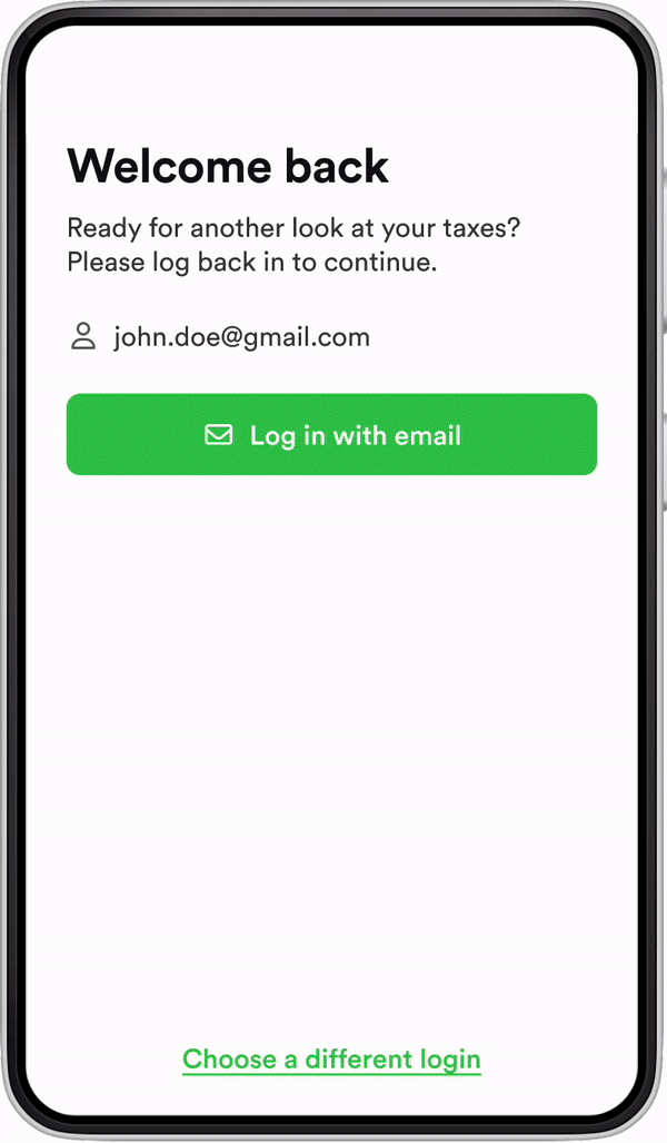
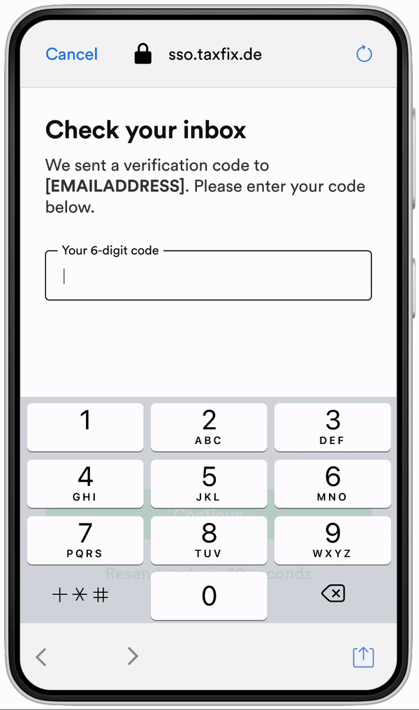
Old
-
Slightly frustrated headline sets a negative tone for the task
-
Weak screen hirarchy
-
Inactive PIN field
-
Available CTA and secondary options by default
-
Show too many options upfront (CTAs, widget specific options)

New
-
Actionable headline guiding users to the next step
-
Visible [email address] removes guesswork where to find the code
-
Feld is in active state by default, removing 1 click
-
Active keyboard creates urgency, nudges users to retrieve the code
-
CTA's are hidden by the keyboard, narrowing the focus on the main task even further
Opportunity 1
Unmoderated user test: "Nothing special"
I created an unmoderated test for the login, including the moment when users get their code via email. on usertesting.com to validate our concept. 14 participants (7 male, 7 female) concluded the login process was "nothing special" - which is exactly what we aimed for. The unmoderated usability test included the detour users had to take to get their code from their emails to test the entire task experience.
Results
-
All testers were able to complete the login
-
General usability rating: 6.4 / 7
-
General satisfaction rating: 6.7 of 7
Stakeholder Management
Alinging with stakeholders
Alining with CS, Product marketing and CRM had to be done to ensure all mission teams were aware of the changes and potential friction points we were introducing for every single of our users and customers. Facilitating these alignment meetings and checking in with all functions was my role in this project as well.
The Result
+1,8% Login success
instead of our target -5%. Although the uplift is small, we were not expecting it! We were super happy :)
Last words
Learnings
If I ever create a login experience like this again, it would be smart to prepare fallback options from the start to react quickly to friction while the rollout is live. Overall though, I'm very happy how this project turned out! I proved that tiny interaction automation and task simplifications add up and increase performance.


